_edited.png)
Multicare Plus
Multicare+ is a community-driven healthcare initiative created to bridge the gap between rural and semi-urban India and advanced medical services. The brand’s mission is simple yet profound — “Healthcare within Reach.” It connects patients to qualified doctors, diagnostics, and medicines in their own communities, eliminating the need for long travel or intimidating hospital visits.

Project Overview
Our objective was to create a unified digital and visual identity that humanises healthcare for rural audiences without losing professional credibility. The Multicare+ website and branding system were designed around clarity, empathy, and local relevance — providing a digital front door to clinics that make quality healthcare locally accessible.
Objective
The core objective was to build a trustworthy brand system that effectively fuses empathy with efficiency in healthcare. This required communicating accessibility, affordability, and compassion as tangible promises.
Design & UX Approach
The website employs a soft, human-centric interface using rounded containers, calm color tones, and clear typography. Visual hierarchy focuses on reassurance first — headline messaging (“Health Care within Reach”) precedes detailed content. Real photographs of doctors and patients from semi-rural setups reinforce authenticity and trust.
Content Structure
The content structure is designed to establish immediate trust and facilitate action. It begins with the Hero Section featuring the promise, "Health Care within Reach," linked to direct CTAs for immediate conversions. The Mission Statement provides tangible proof of scale, defining the operational model. The Core Values humanize the brand.
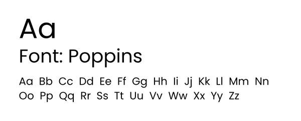
Typography & Colour
The brand uses Poppins Bold for headers and Poppins Regular for body text. This communicates clarity, warmth, and modern reliability - ideal for community healthcare.