_edited.png)
Better Daily
Better Daily is a modern superfoods brand built on the philosophy of “Real Food, Real Fast.” Their mission is to simplify healthy living for busy individuals through plant-based smoothies made with real fruits, vegetables, and protein — no sugar, no preservatives, and no prep. The challenge was to communicate science-backed nutrition with the ease and emotional appeal of a lifestyle brand, while ensuring the website serves as a seamless e-commerce experience for Tier 1 Indian markets.
.jpg)
Project Overview
We designed and developed Better Daily’s digital platform to reflect its commitment to clean nutrition and everyday wellness. The site’s architecture was built to quickly communicate the brand story, product benefits, and buying process in one scroll-friendly experience. The homepage establishes clarity with a bold hero section — “Protein Reimagined. Real Food Real Fast.” — followed by structured content that answers why the brand exists and how it fits into users’ routines.
Objective
To effectively position Better Daily as India's trusted and accessible functional-nutrition brand, we'll create a visually distinct and high-trust online presence utilizing a scalable design system. The key focus will be on simplifying the user journey from initial brand awareness to the crucial first purchase through intuitive design and clear messaging.
Design & UX Approach
Our design strategy balanced nutrition science with lifestyle emotion. The layout uses large, tactile product photography and generous whitespace to create a sense of cleanliness and credibility. Clear hierarchy, strong CTA placement (“Blend, Sip & Glow”), and modular information. We optimised for mobile-first browsing, fast loading, and minimal scroll fatigue to align with modern user habits.
Content Structure
The Content Structure efficiently merges education and conversion. It immediately establishes the core value proposition, then uses a simplified, logical flow to build user understanding and ultimately instill confidence that ensures the brand's credibility.
Typography & Colour
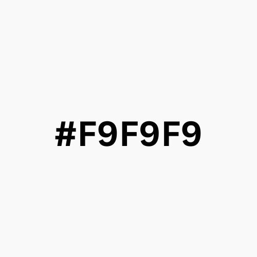
For Better Daily, the goal was to create visual freshness and accessibility, balancing the scientific nature of functional nutrition with an approachable, everyday appeal. The typography and color palette were meticulously chosen to reflect simplicity, trust, vitality, and the brand’s commitment to natural, plant-based health.


